
The Smart Grid: Rethinking Layouts in the WordPress Block Editor
How WordPress Developer Shaun Jenkins engineered the Smart Grid to solve the Block Editor’s biggest layout problems
There is a quiet revolution happening inside the WordPress editor – but for us, it didn’t start as a grand idea. It started with a problem.
Recently, while working on the new Affinity website, we had a rare opportunity, without the usual client constraints, to step back and rethink parts of the WordPress editing experience.
While building the new Affinity website, we needed the Block Editor (Gutenberg) to do two things well: give developers the control to create flexible layouts, and give the wider team – our content writers, marketers, SEO specialists – the confidence to actually use it.
At first, that felt achievable. The foundations of the Block Editor are strong, and on the surface it promises exactly that balance.
But then we put it in front of someone outside the dev team.
When Steph, our SEO specialist, started working with the editor, the cracks showed quickly. Simple tasks became unclear. Layout changes required understanding how blocks were nested. The system assumed a level of technical knowledge that most users simply don’t have – and shouldn’t need.
This wasn’t a one-off usability issue. It exposed something deeper.
There is a fundamental tension in the Block Editor: you are either writing content, or you are building layouts. For years, we’ve accepted this trade-off. You either stay in a clean, document-like experience and sacrifice design flexibility, or you dive into complex structures – columns, groups, nested blocks, and sacrifice usability.
While working from our UX/UI designer, Mike’s, original visual designs, that tension became impossible to ignore. We didn’t just need something powerful – we needed something usable.
So I stepped back and started asking a different question:
What would a middle ground look like?
A tool that keeps the simplicity of writing, but gives you real control over layout, without requiring you to think like a developer?
That question led to a rethink of how layout should work entirely.
Enter the Smart Grid.
It’s not just a small improvement, it’s a rethink of how layout works in WordPress, shaped directly by the problems we ran into.
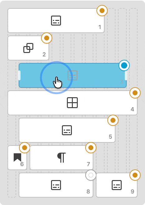
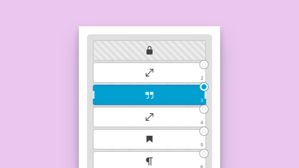
The Smart Grid introduces a powerful, visual Minimap interface that completely reimagines layout control within the editor. Instead of wrestling with nested group blocks or typing arbitrary percentage values into hidden settings panels, the Minimap virtualises your entire structure onto a mathematically precise 12-column grid. You simply grab the handle of any block and drag it to adjust its width or starting offset. As you move the cursor, the block snaps instantly to the nearest valid column track, providing tactile, immediate feedback.
Instead of forcing a content creator to build pages through rigid structures like columns and deeply nested groups, Smart Grid simplifies the experience. You can drop any block straight into a layout and adjust how it behaves without having to untangle layers of containers.
At the centre of it is a single control point, a kind of “mission control” for your layout, where you can manage size, spacing, and position in a clear, visual way.
The goal is simple: to give you the flexibility of a powerful page builder, without the complexity that usually comes with it.
It also recognises something that’s true of most websites: the person creating the content is usually making design decisions too.
You might say “just write the article”, but in reality that same person is choosing images, adding calls to action, and shaping how the page looks and feels. Most teams don’t have a clean split between content and design – people wear multiple hats.
Smart Grid leans into that.
Acting as your layout’s Mission Control, the Smart Grid Manager offers a clean, visual interface to define structural rules without having to wrestle with standard column blocks.
The Physics of the Grid
Smart Grid lets you focus on writing when that’s all you need, but gives you control over layout when it matters, without forcing you into it.
To understand why Smart Grid matters, it helps to look at what’s not working today.
When you use standard columns in the Block Editor, you’re essentially locking content into fixed positions. Once something is placed, moving it or reshaping the layout often means rebuilding parts of the page.
Smart Grid takes a different approach.
Instead of rigid structures, it uses a flexible grid system behind the scenes – one that lets content move and adapt more freely without breaking the layout. The result is something that feels lighter, more predictable, and easier to work with, whether you’re making small edits or bigger layout changes.
In Smart Grid, blocks aren’t locked into vertical lanes or silos any more – they behave more like pieces you can move around freely within a space.
By default, everything flows into place automatically. As you add content, the layout adjusts around it, so you’re not constantly managing structure in the background.
When you do want more control, you can step into it.
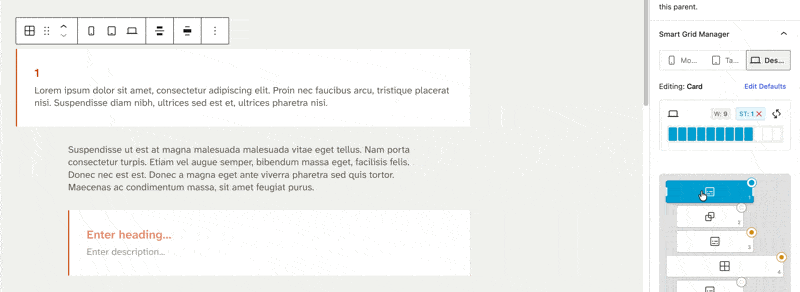
The connection between the editor and the Smart Grid Manager is completely seamless. Clicking an element in the sidebar instantly highlights its counterpart on the canvas. As you adjust widths visually in the panel, your actual content updates in real-time.
A minimap gives you a bird’s-eye view of the entire layout, making it easy to see how everything fits together and make quick adjustments without getting lost in the details. Think of it as a simple control layer, there when you need it, out of the way when you don’t.
You can also select multiple blocks and move them together as a group, keeping their structure intact as you reposition them. It’s a small detail, but it makes a big difference when you’re working on more complex layouts.
And importantly, all of this is built into the editor itself, so you can make layout changes without breaking your writing flow.
Smart Defaults and Ghost Inheritance
The feature that transforms the block into a production powerhouse is the Smart Defaults system. The Smart Grid introduces the concept of Global Inheritance.Under the hood, Smart Grid uses something we call “Ghost Inheritance”.
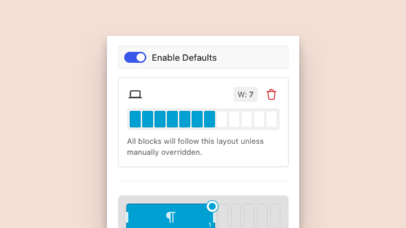
The Smart Defaults system introduces Global Inheritance, allowing you to define standard grid behaviours that all child blocks automatically inherit.
In simple terms, it means the layout handles most decisions for you by default, but keeps track of anything you choose to change.
When you’re working in the minimap, you’ll notice that most elements sit in a kind of “default” state. But as soon as you adjust something, like resizing a block, it’s marked as something you’ve customised.
That distinction matters.
It means you can experiment with layouts freely, knowing you can easily reset individual elements back to their original state without affecting everything else.
So instead of worrying about breaking your layout, you can focus on shaping it, with the confidence that you can always roll things back.
You can set a rule for the entire grid.
Deep-Level Performance Engineering
A significant amount of engineering ensures the block handles complex layouts responsively.
The Smart Grid separates these concerns entirely.
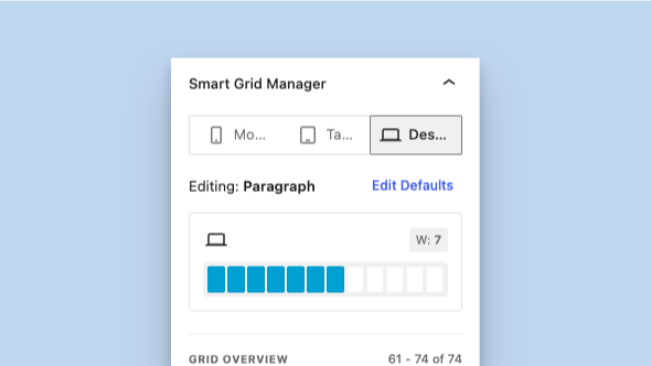
The block has triple-device logic with separate, dedicated control layers for Mobile, Tablet and Desktop.
Blocks fluidly adapt to the 12-column system, allowing seamless transitions from full-width elements (Span 12) to intricate multi-column layouts (Span 3) without the need to write custom CSS.
Behind the scenes, Smart Grid is designed to stay fast and responsive – even as layouts become more complex.
For most people, that just means the editor feels smooth. You can move things around, experiment with layouts, and nothing lags or breaks your flow.
Under the hood, there’s a bit more going on.
- Large layouts are handled in smaller chunks, so the browser isn’t overloaded all at once.
- Heavier operations are pushed into idle time, keeping interactions responsive.
- Movement is tracked efficiently to keep everything running at a consistent 60fps.
- The undo history is managed carefully, so you don’t end up stepping through dozens of tiny layout tweaks.
None of this is something you need to think about while using it – but it’s what makes the experience feel solid when you do.
Built with Developers In Mind
Under the hood, Smart Grid is designed to fit cleanly into modern WordPress development.
It follows a simple principle: keep the logic central, and keep the output clean. Layout decisions are handled in one place, while the blocks themselves stay lightweight – so what gets saved is straightforward, usable HTML.
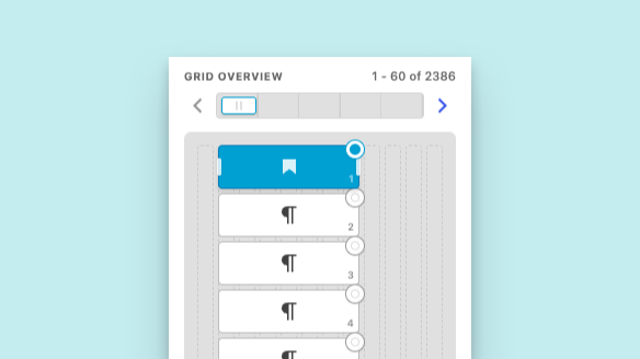
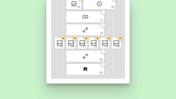
Virtualised pagination within the inspector ensures the interface remains highly performant and responsive, even when managing grids containing thousands of individual blocks.
For developers, that means less overhead, more control, and no unnecessary complexity in the frontend.
Much like tools such as Advanced Custom Fields, Smart Grid isn’t just a one-off feature – it’s something designed to be reused. A solid foundation you can build on across projects, whether you’re creating bespoke layouts or scaling a full site.
Contact Us
If you are tired of compromising between a clean editing experience and frontend performance, it is time to upgrade your workflow. Get in touch to discuss how we can engineer a robust WordPress solution for your next project.